
Project Overview & Challenge:
Eyewa, a leading online eyewear retailer in the Middle East, faced a significant challenge. Despite offering a wide range of optical products, the conversion rate on the website was unsatisfactorily low. Users often found the purchasing process confusing and cumbersome.
Eyewa needed a solution that would not only simplify the user experience but also address key business goals.
Role:
Product Designer
Tools:
Figma, Excel, Google Docs, Live Data (Website)
Team:
Designer, Stakeholders, Marketing Team, Product Owner
Diving into the Process
To address these issues, I embarked on a comprehensive process divided into four stages: Understand, Converge, Explore & Develop, and Validate.


Laying the Foundation
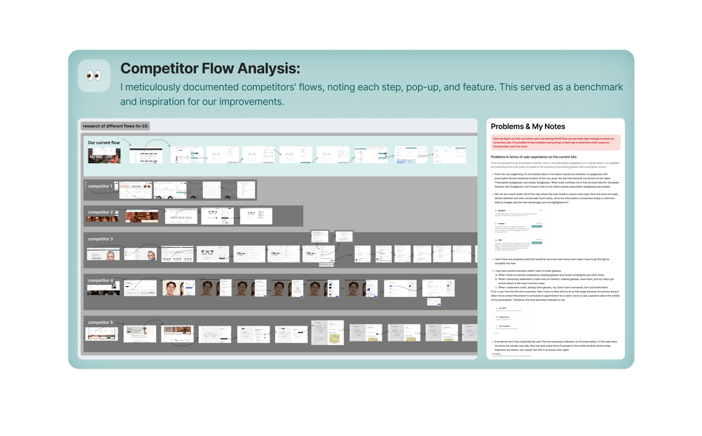
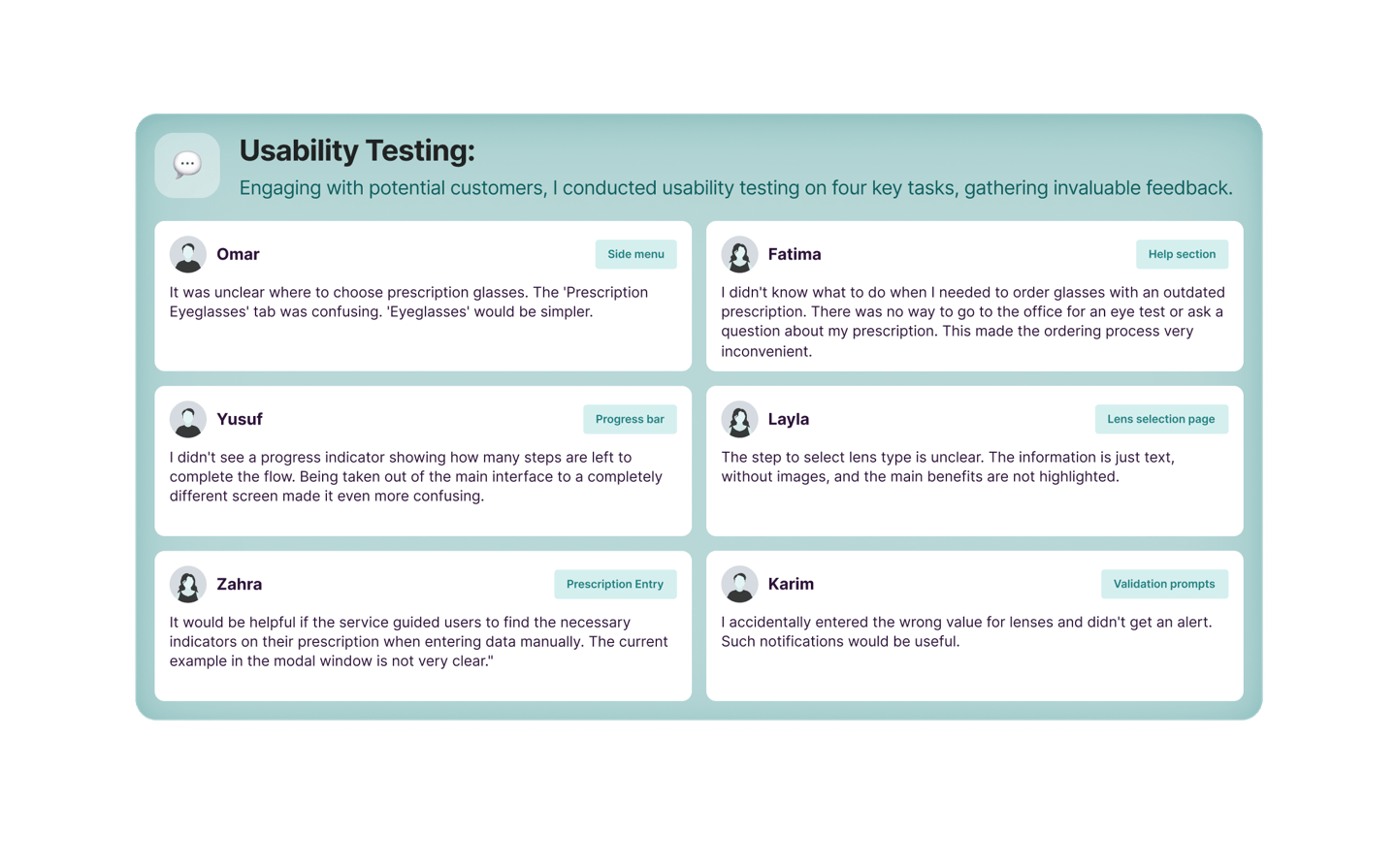
We began with an in-depth study of the existing problems:


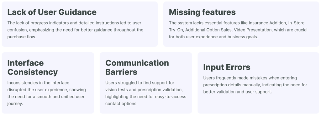
Identifying Key Areas for Improvement
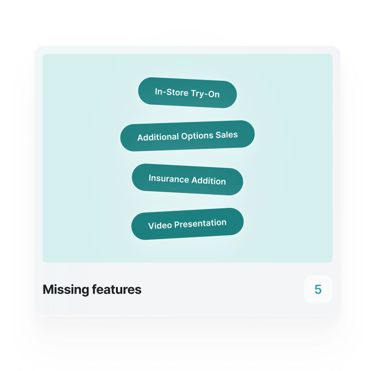
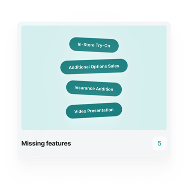
With the insights gathered, I pinpointed five critical areas for enhancement:


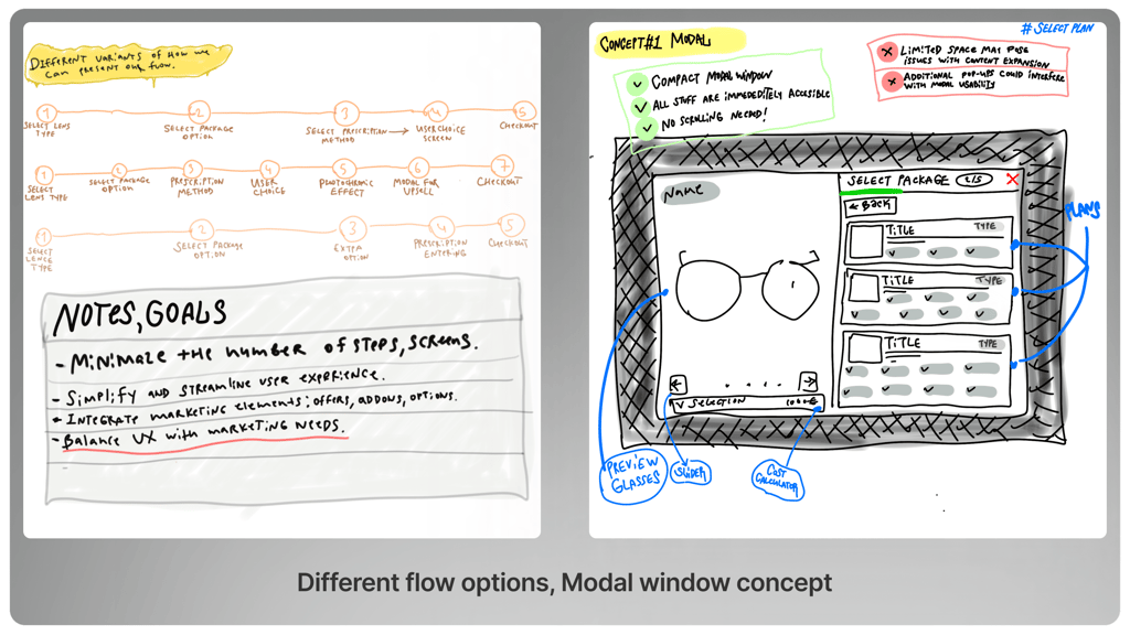
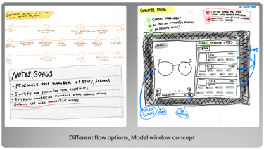
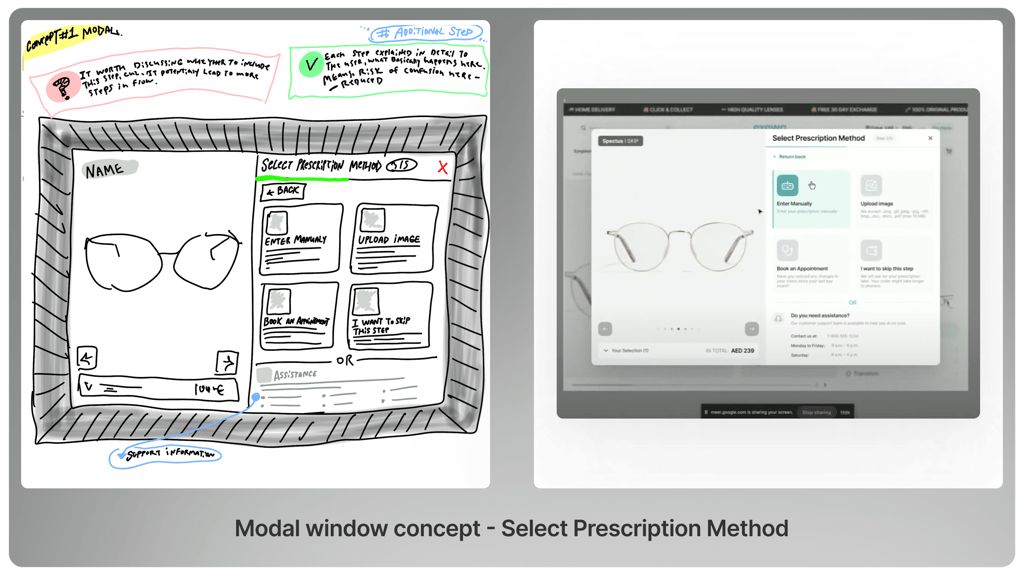
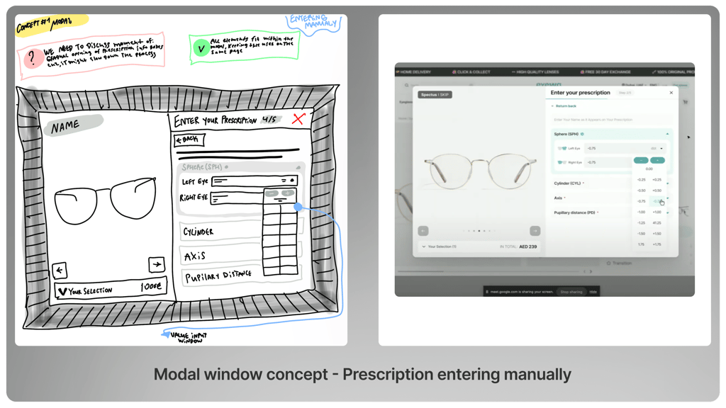
Concepts and Iterations
We moved to the ideation and design phase:
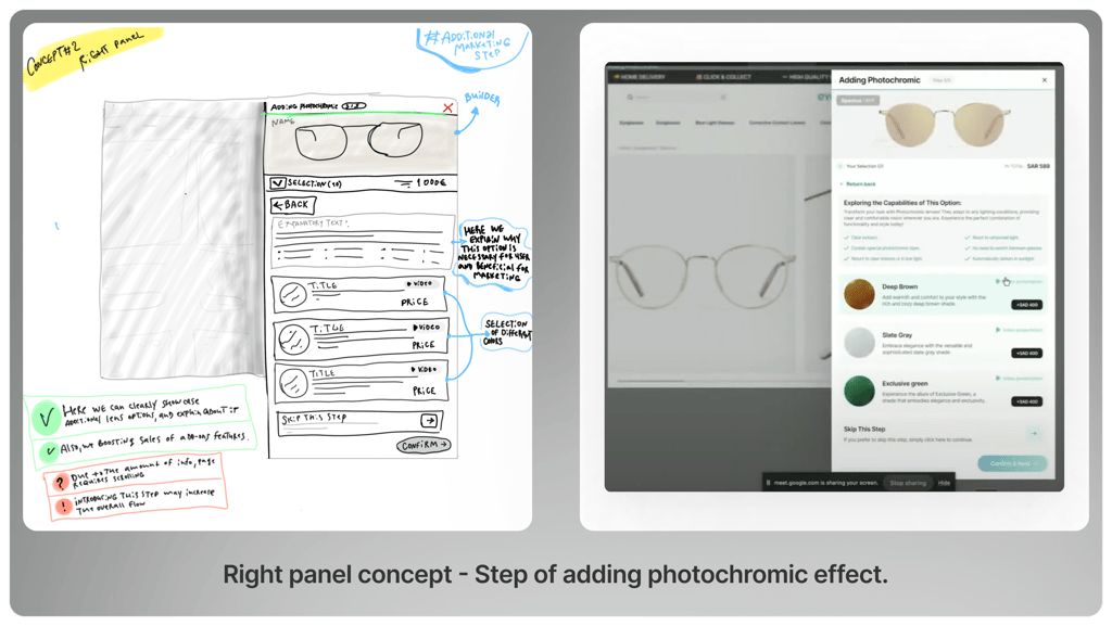
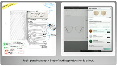
Refining Our Approach
After several iterations and thorough testing, we held discussions with our team to assess the feedback and performance of each concept. Based on these insights, we decided to pivot towards a different approach. Our focus shifted to the right panel design, which better aligned with both user needs and business objectives.


From Concept to Detailed Design
Once we selected the optimal concept, I began working on the detailed design. I concentrated on several key elements:


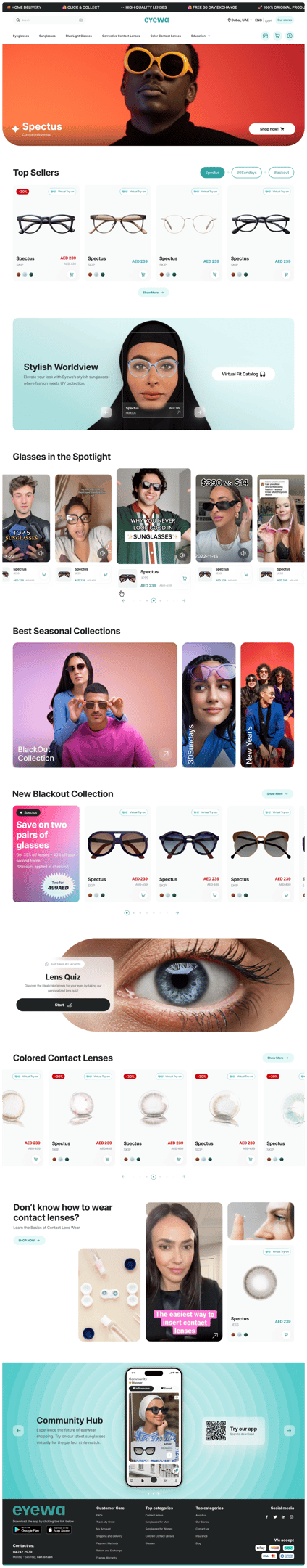
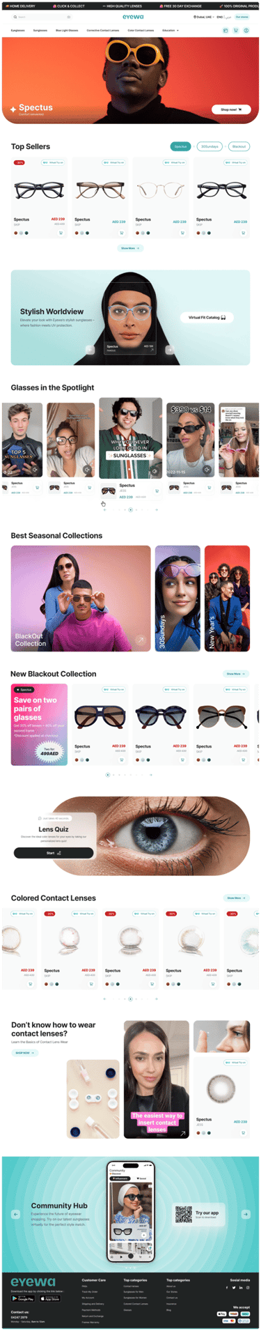
Step 0:
Homepage
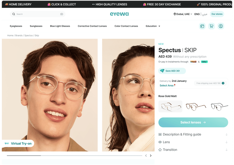
Step 1:
PDP Page
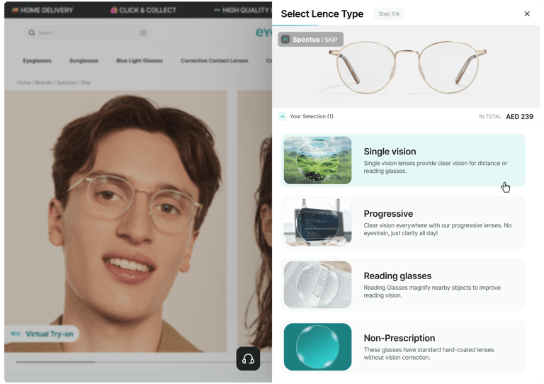
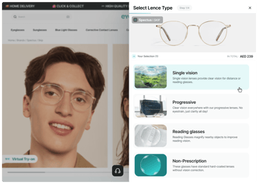
Step 2:
Select Lence Type

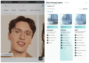
Step 3:
Select Package Option
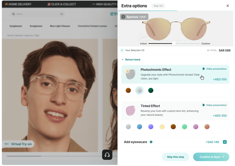
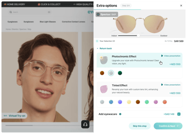
Step 4:
Extra options
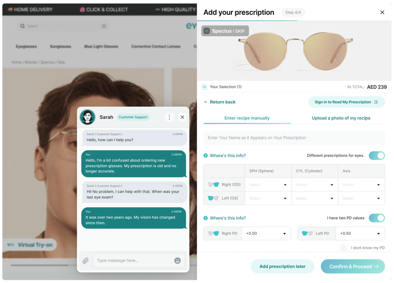
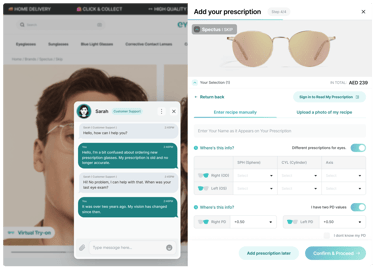
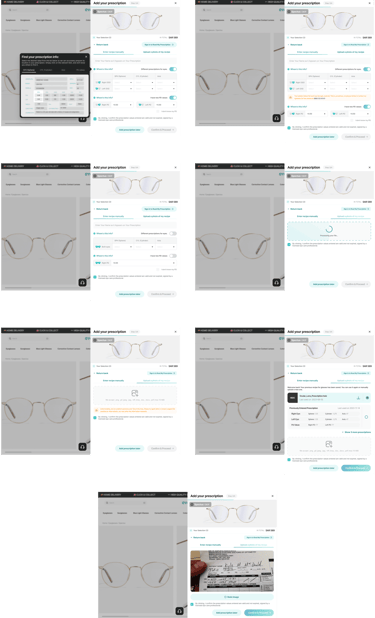
Step 5:
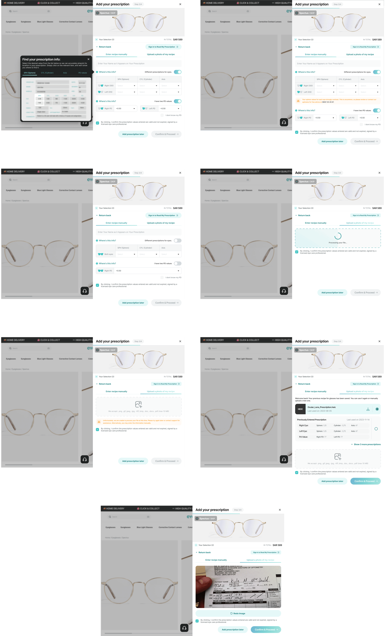
Add your prescription / Online Chat
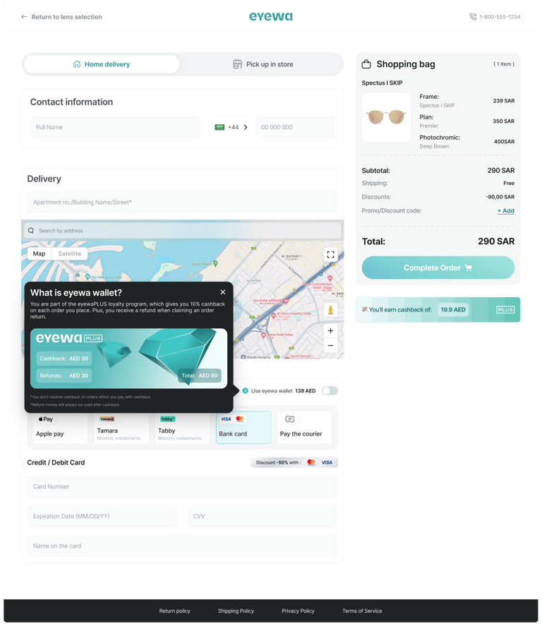
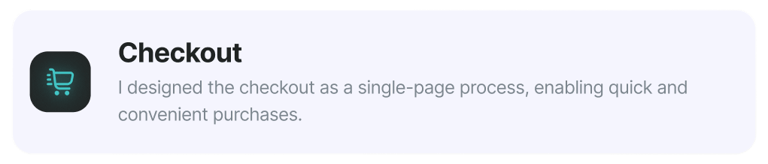
Checkout:
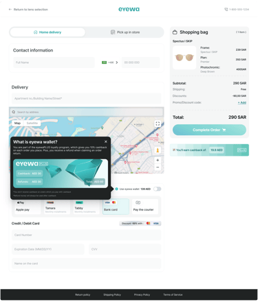
Home delivery
Checkout:
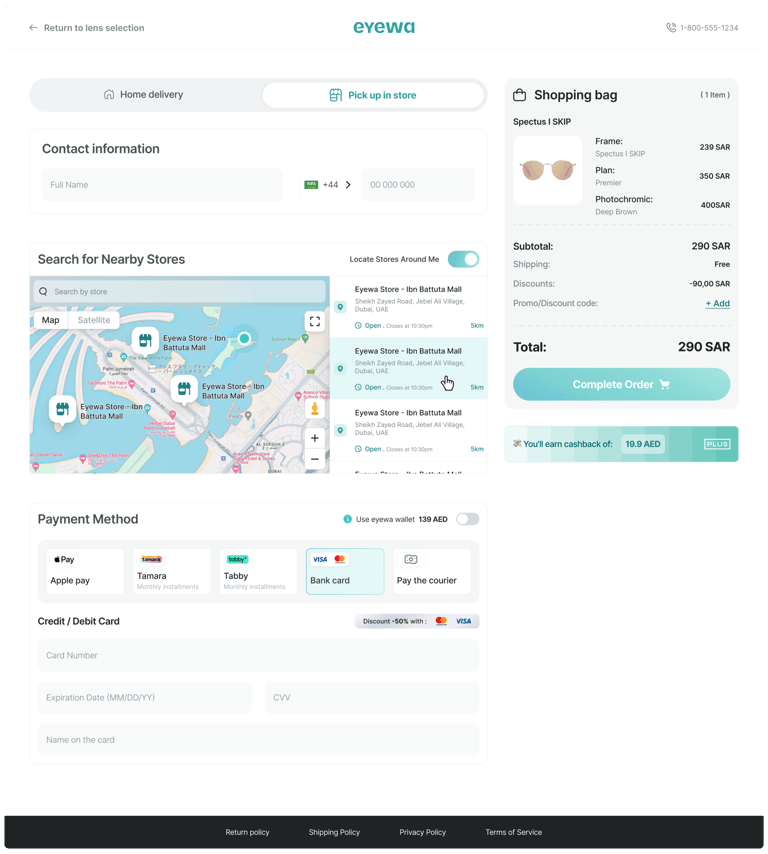
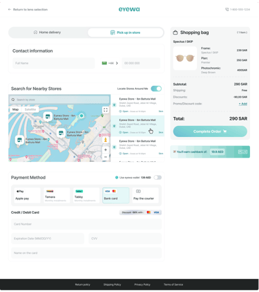
Pick up in store

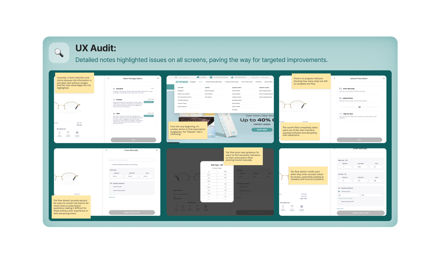
Edge Cases
To ensure a seamless user experience, we addressed various potential edge cases identified during UX research. These screens showcase scenarios like error messages, tooltips, and additional explanations to help users navigate through potential challenges and misunderstandings.
Key Solutions
In this section, I want to highlight the key areas I focused on during the project. I'll provide examples of how these elements looked before and how they appear after the redesign. Here are the main points of focus:
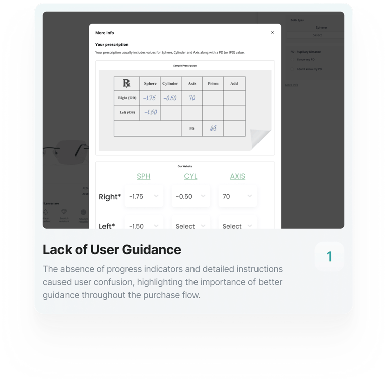
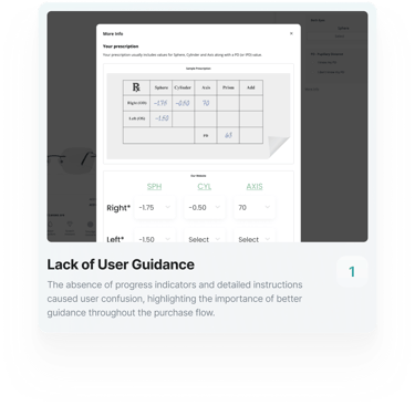
Enhanced User Guidance

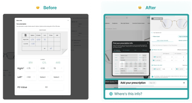
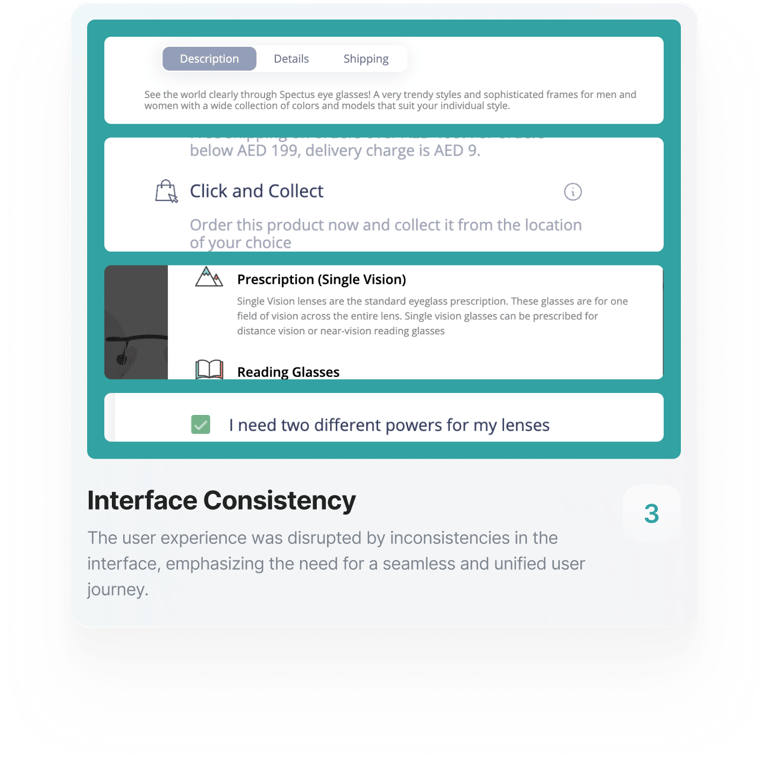
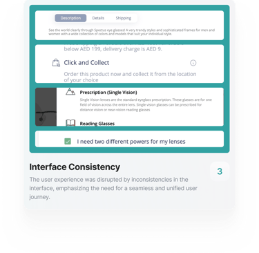
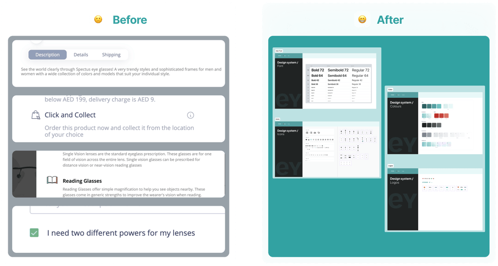
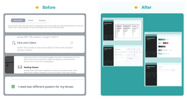
Interface Consistency
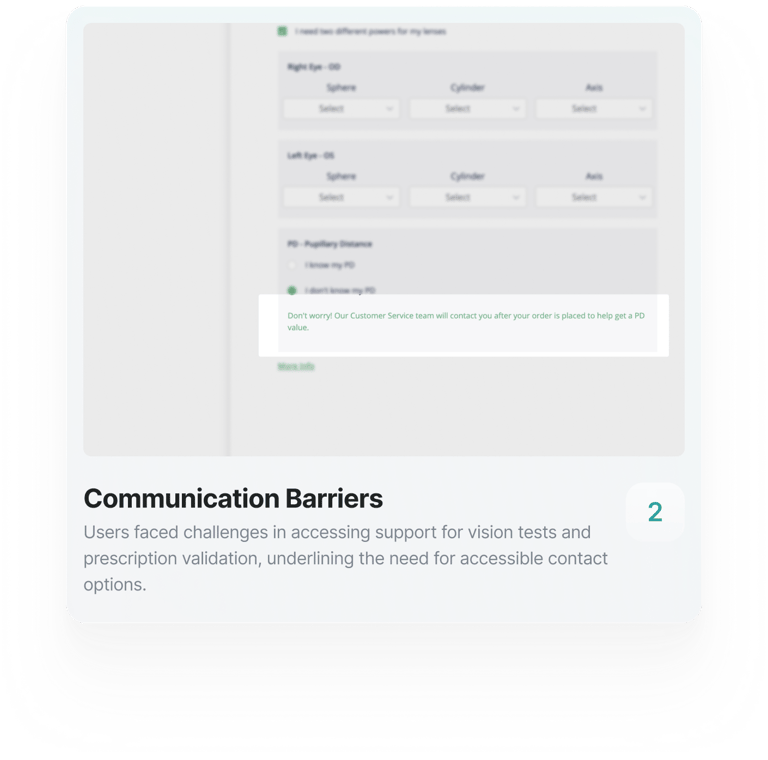
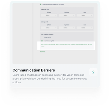
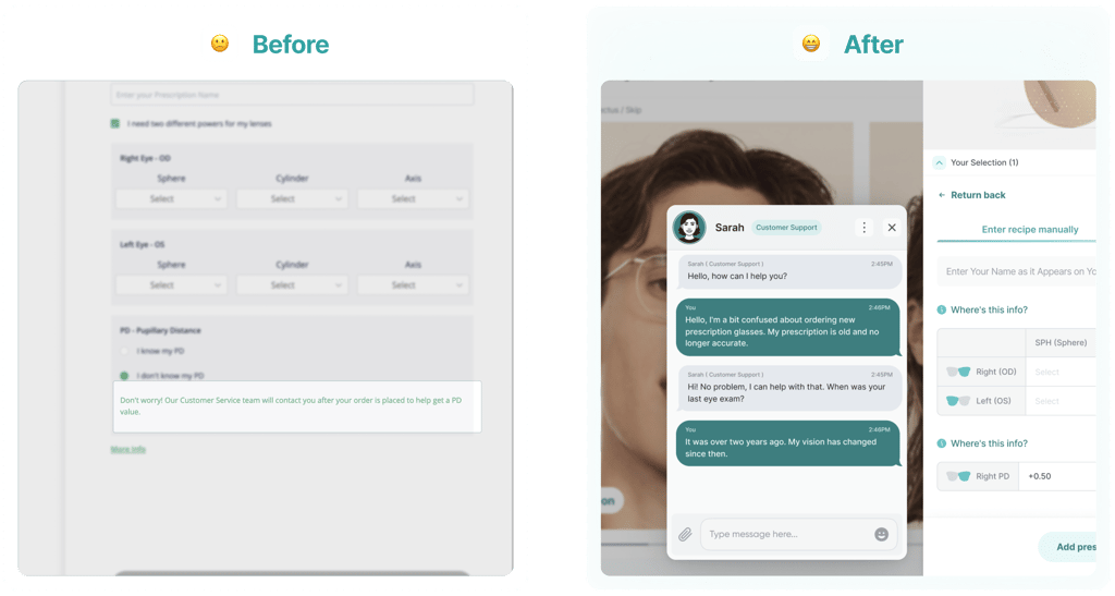
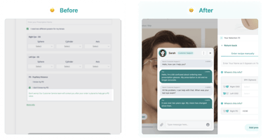
Communication Barriers
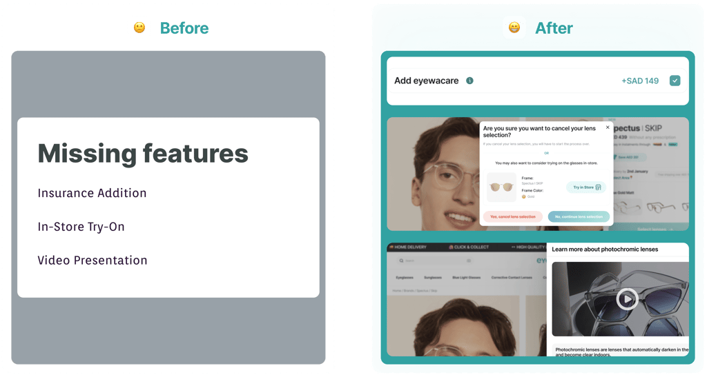
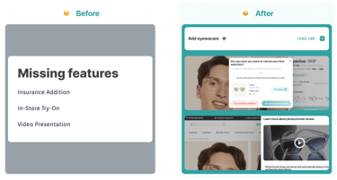
Missing features
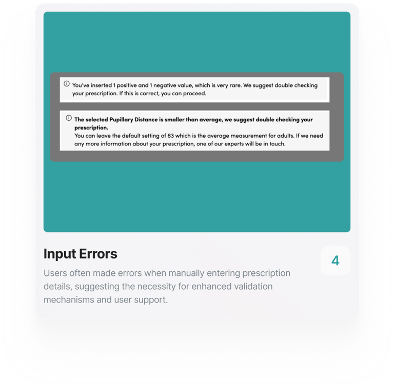
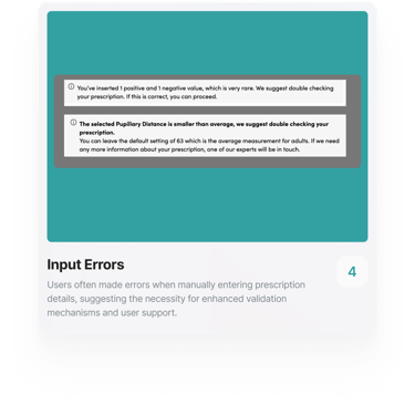
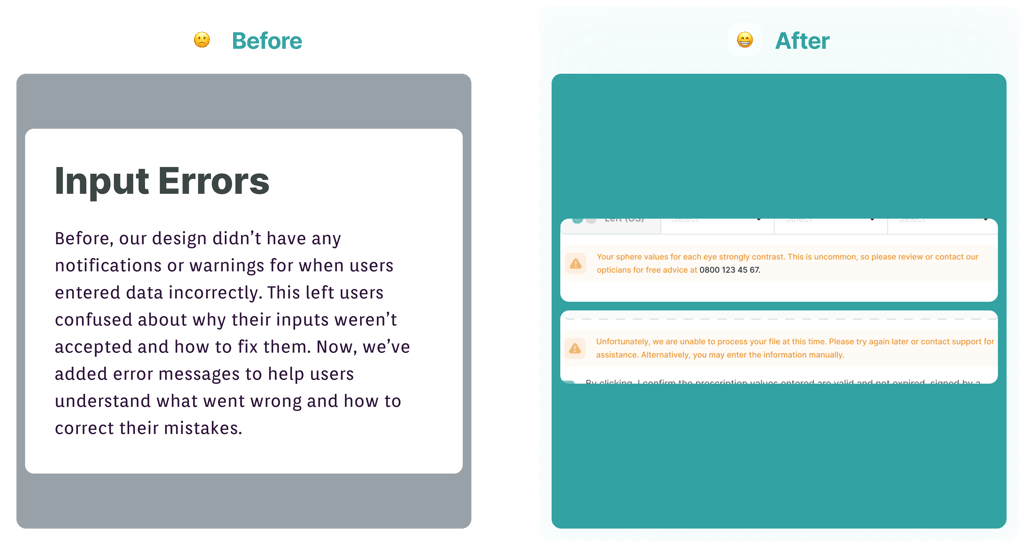
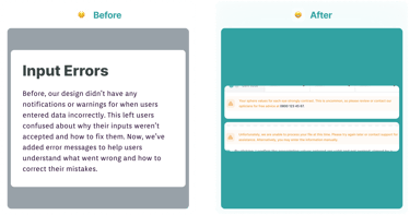
Input Errors


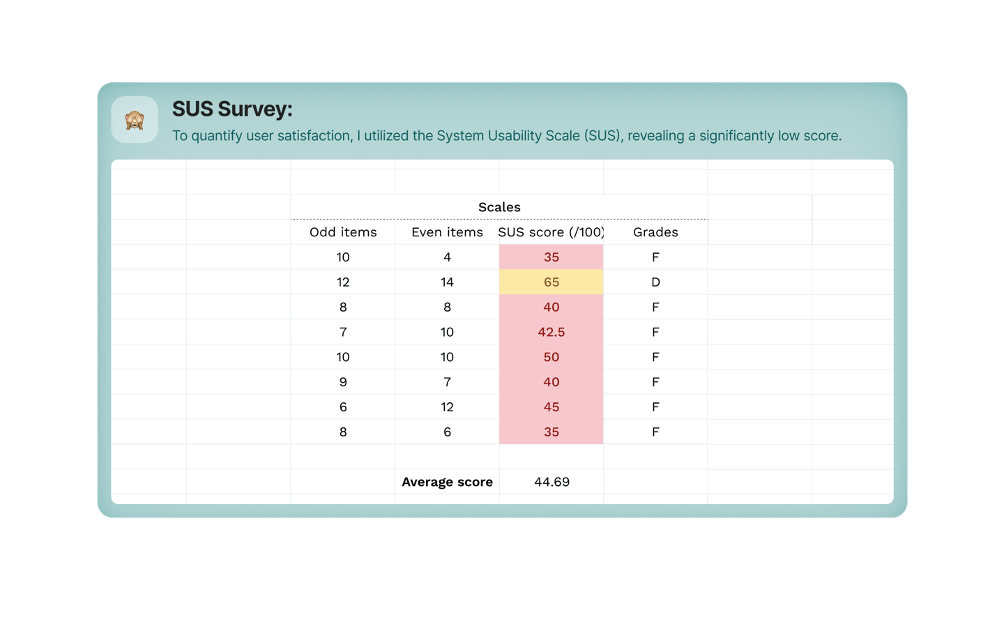
Proving Success
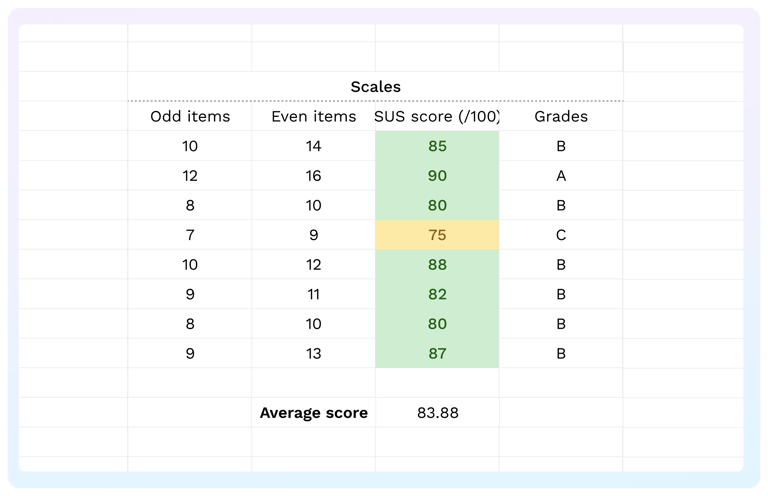
To confirm the effectiveness of our new design, we conducted a System Usability Scale (SUS) survey. The average SUS score significantly improved from 44.69 to 83.88, indicating much higher user satisfaction and usability. This validation demonstrates that our new design is successful and is already in development.
UX is never done!
Once this work is live, I plan to take the following steps: